1. Background
One of the main factors causing prevalence of disease is public unawareness. Today, communication and information technology play important roles for promoting the awareness of people for considering the health advice and sharing data about diseases. However, most information presented by this kind of media is numerical and statistical and may not transfer proper analytical and visual perception of existing condition of disease.
Using available tools in geographical information system (GIS), helps users to geo-visualize reports and various information related to health in form of maps and shares suitable perception of existing conditions (1).
Existing data related to health are usually assigned to large map units such as ZIP codes and cities. Various cartographical methods such as symbols, colors or patterns are being used to indicate the severity or number of reports in the region to geo-visualize the information assigned to each area. For displaying the number of occurrences of an event such as disease in a region, “point density” maps are used where any point in the area indicates given number of related occurrence. In Choropleth maps, related regions are indicated by colors, patterns and/or by different color intensities to display and compare the difference of information reported in a region in comparison to others (2).
There are different reasons for high use of regional maps for spatial visualization of health information. First, most data related to health are often reported in a zonal system. Second, as existing maps do not indicate the accurate place of occurrence, one can ignore the concerns about privacy of individuals and reliability of data (2).
WebGIS technology let us access great sources of spatial and descriptive data in the shortest time with the lowest cost and in any place. By desktop GIS software, the user usually needs to buy the software and learn how to use general tools and facilities of GIS software for doing query and spatial analysis. However, WebGIS helps users to access data in any place and time and apply the analysis using required functions with no need to install any GIS software (3).
Various WebGIS have been developed in the area of Geo-visualization of health data; however, most of existing WebGIS sites present static maps and rarely provide users with interactive tools to produce their own maps. For example, the website of cancer mortality map (4) indicates information about mortality due to different cancers in the USA, based on several factors such as year, age, and gender. Users can choose information about different cancers and observe the result visually in terms of a Choropleth map. In this system the parameters of Choropleth map have been pre-defined by the system and users cannot change them.
The main aim of this study is to design an interactive WebGIS system in which people could simply produce and observe their favorite maps of different cancers and environmental parameters. They can use this tools to produce their personalized maps and explore various aspects of the cancer.
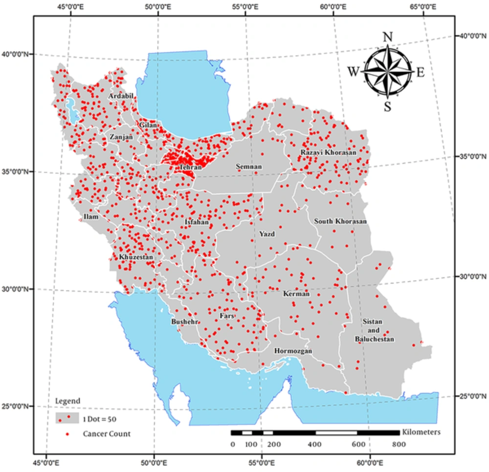
Cancer, after cardiovascular diseases and road accidents, is one of the most important reason of mortality in Iran. Among 85,000 new cancers per year, it comprises 55.5% males and 44.5% females. The most prevalent cancer among men includes stomach followed by urinary bladder and colon. Among female, the most prevalent cancers include breast, skin and then stomach. Maximum statistics for occurrence of cancer among women has been reported in Yazd and among men reported in Markazi province. Figure 1 indicates total situation of cancers reported in any province in 2006, according to the report provided by ministry of health and medical education.
2. Objectives
The main aim of this study is to design an interactive WebGIS system in which people could simply produce and observe their favorite maps of different cancers and environmental parameters. They can use this tools to produce their personalized maps and explore various aspects of the cancer.
3. Materials and Methods
3.1. Preparing the Data
Data related to the occurrence of various kinds of cancers and environmental factors are two main used sets of data in this research.
3.1.1. Cancer Data
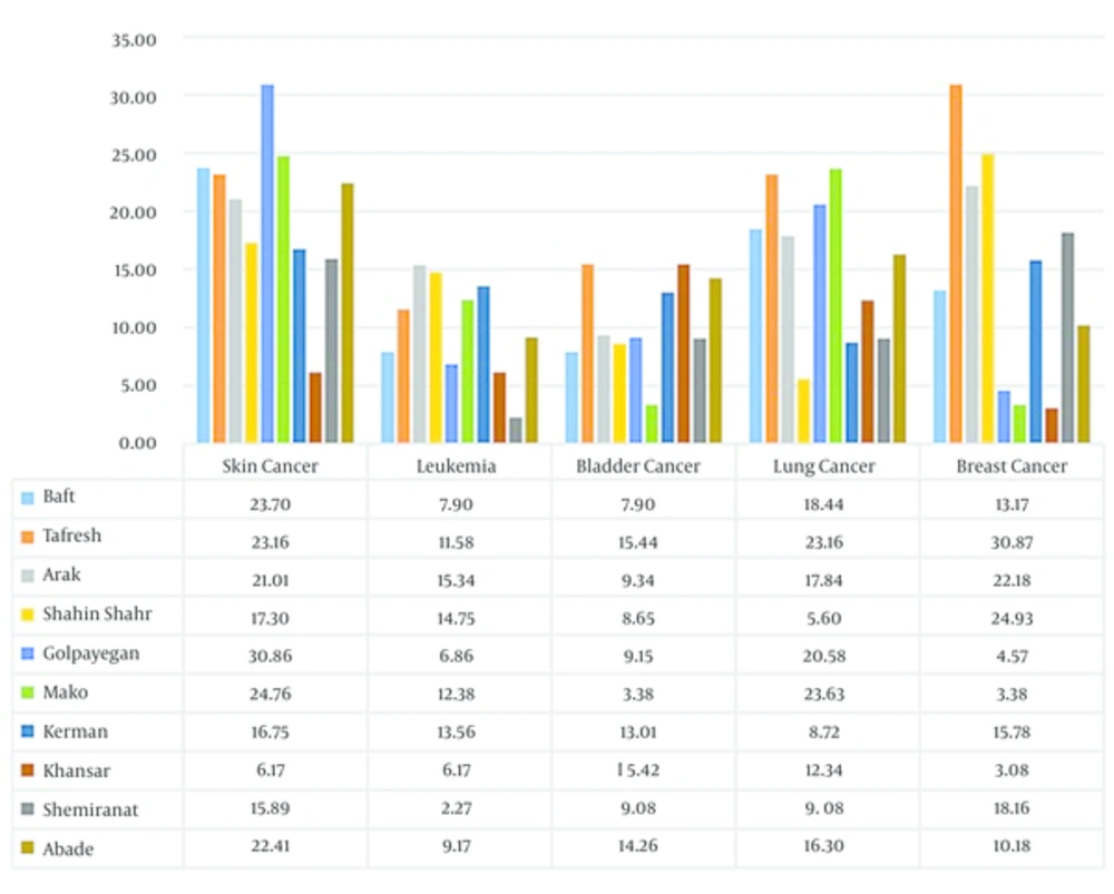
This data includes the number of occurrences of common cancers such as breast, lung, bladder and blood. Cancer data are based on the report published by ministry of health and medical education in 2006. Figure 2 illustrates the situation of skin, breast, blood, lung and bladder cancers in most prevalent towns. Attribute cancer data in excel format were geocoded at district level in their corresponding location within GIS environment.
3.1.2. Environmental Data
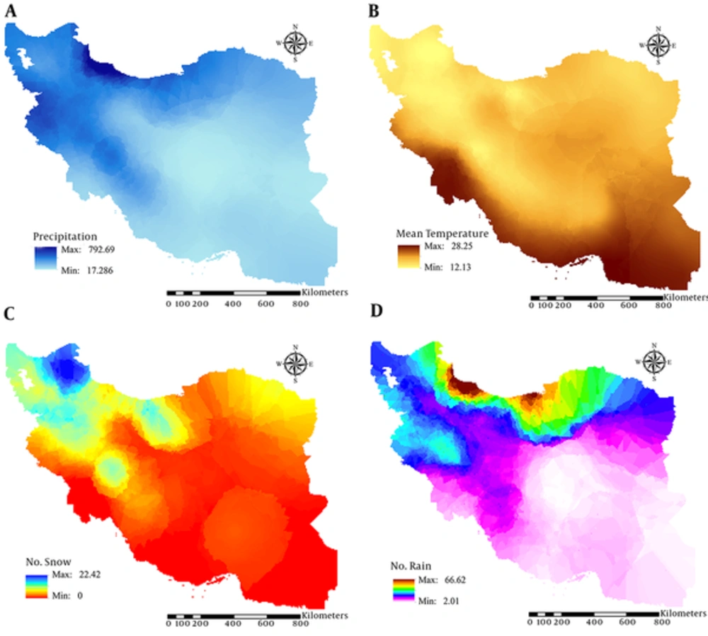
Environmental parameters include the number of rainy days, the number of snowy days, precipitation, and average of temperature that is obtained from 306 synoptic stations. These data are not available for the whole country and were interpolated by IDW (inverse distance weighting) approach to estimate these parameters for all areas. Interpolation is a method for finding the value of function in an interval, when the value of function is given in some discrete points (5) (Figure 3).
The output of interpolation is a raster file. As a result, the values of pixels in each town is averaged and recorded in the table of each town. Figure 4 indicates steps for preparing the environmental data.
3.2. WebGIS
Quick development of web and its combination with GIS capabilities, introduced WebGIS, which in a general classification could be divided into four generations (6). First generation called data receive (about 1994 to 1996). One of the first WebGISs of this generation published by US Census Bureau in 1990 that provided the people with TIGER files including basic maps of the country. Before establishing this WebGIS, for accessing these data, people had to refer personally, however, by establishing WebGIS, data access was very quicker and easier. The second generation is called static maps (about 1994 to 1999) (7). During this period GIS users started using this capability and published their maps on the web such as online map atlases. Canada Atlas is considered as a prototype of this generation published in 1994 (7). The third generation is called interactive maps (about 1999 to 2004) and it provides users with possibility of taking query in the database and producing favorite maps. NKLA (neighborhood knowledge Los Angeles) project was the first project developed by this technology that provided the possibility of free access to attribute data in the database and took complicated queries and produced maps for different groups (8). Next generation is called user interaction (since 2004) made by appearance of Web 2.0 and increased interactivity of users with Internet. WebGISs of this generation are a combination of scalable capabilities of web 2.0 and accessing the user-made contents. NKCA (neighborhood knowledge California) is one of the first websites of this generation (9).
By development of technology, today people can easily access the internet by their electronic devices such as mobile phones in any place and use its services. By using WebGIS in the field of health, we can provide people with extended spectrum of services related to health issues. By appearance of interactive WebGIS, users can select a variable or layer among facing options. By this approach, one can also use the ideas, feedbacks and experiences of others (7).
The most important advantage of web is that anybody in any place of the world could access it only by having the least facilities and having access to the Internet via a web browser. Combining this very suitable capability with GIS capabilities in the field of health can help decision makers. Generally, WebGIS in the health field comes with following advantages (6):
1) One can immediately access data from any part of the world;
2) People can share their analyses tools via internet and others could access them freely;
3) By WebGIS anybody with any level of knowledge could participate and be provided with spatial analysis;
4) It is possible to participate many users with different specialties in a space for investigating different dimensions of an event or disease;
5) Considering immediate access to data provides early diagnosis of disease;
6) Understanding the pathogen events is very important for controlling the disease. Various factors must be investigated based on time of outbreak for knowing and discovering different pathogens. By accessing various databases, WebGIS could meet such needs.
3.2.1. Point Density Maps
When it is needed to display information about the number of occurrences such as disease outbreak or population, point density maps are very suitable.
A dot density map is as a map type that uses a dot symbol to show the presence of phenomenon. Dot maps rely on a visual scatter to show spatial pattern. For producing these maps, there are put given number of points in any location and any point indicates given number of related event (9). By using point density maps, one can have a suitable spatial visual perception of distribution of the considered parameter. To have better visual display for such maps, in some cases, symbols are also used instead of point and/or any point is displayed in different size (9).
Figure 1 indicates the number of cancers in Iran reported for each province. As Figure 1 illustrates the number of cancers in Northern provinces of Iran is tangibly more than other provinces.
3.2.2. Choropleth Maps
A choropleth map is a thematic map in which areas are shaded or patterned in proportion to the measurement of the statistical variable being displayed on the map, such as population density or per-capita income. The choropleth map provides an easy way to visualize how a measurement varies across a geographical area. Choropleth maps are one of the simplest approaches for detecting the clusters by which one can visually detect clusters and critical regions.
Health data usually contain classification, ratio, or other statistical parameters and Choropleth map is used for displaying this kind of data (10). In Choropleth maps, values are put in classes with given distances and a color/color intensity or a specific pattern is allocated to any class. In Choropleth maps, the distances of classes and coloring are very important in producing Choropleth maps and must be determined based on the objective of classification. Changing the way of classification will result in changing the output map and the interpretation will also change. In this case, there are different classification approaches:
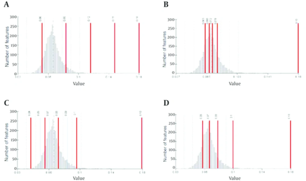
1) Equal interval divides the data into equal size classes (e.g., 0 - 10, 10 - 20, 20 - 30, etc.) and works best on data that is generally spread across the entire range. A common approach is to consider equal intervals for classes. To obtain enough length of interval, we must divide the difference of maximum value from minimum value by number of classes (Figure 5A).
2) Quantiles will create attractive maps that place an equal number of observations in each class: If you have 30 provinces and 6 data classes, you will have 5 provinces in each class. This kind of classification is desirable for data distributed linearly. Because disorders are classified by the number of any class, it is possible to put similar disorders in neighborhood classes and or disorders with different values in a class (Figure 5B) (2).
3) Natural breaks is a kind of “optimal” classification scheme that finds class breaks that (for a given number of classes) will minimize within-class variance and maximize between-class differences. This classification method is conducted according to natural grouping in the nature of data. Fracture points are selected such that similar disorders are put in a class as best as possible and differences between classes increase (Figure 5C) (11).
4) Standard deviation indicates that how far is the trait of a disorder from mean. In this approach the value of mean and standard deviation is calculated from mean. Then using these values, the place of fractures are determined (Figure 5D) (2).
After determining the classes and range of each class, choosing the color is very important in Choropleth maps. By choosing desirable colors, one can have a suitable vision of the data. For coloring the Choropleth maps, there is usually considered a beginning and an ending color and according to that, they make color based on the size of classes such that they could both indicate the difference between classes and detect the neighborhood classes (2). For this purpose, there are three common methods (12):
1) HSV is the abbreviation of words Hue, saturation and value. According to HSV, we can make a cylindrical color space comprising all colors. In HSV based on the number of classes, it makes a linear relation between H of beginning color to ending color, S of beginning color to ending color and V of beginning color to ending color and it creates color based on it.
2) CIELab also performs like HSV with the difference that it does not change in Hue and it only norms the colors of classes between beginning and ending colors and for norming them, it uses the shortest path in the color spectrum between beginning and ending color.
3) LabLCH is similar to CIELab method with the difference that in the process of norming the colors, it uses a method like HSV instead of shortest path in the color spectrum, in which colors have been considerably normed.
Figure 6 indicates the coloring approach from red to green using above methods.
3.3. Designing and Implementation
3.3.1. System Architecture
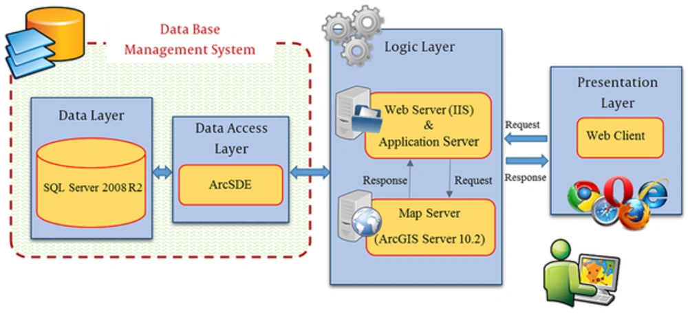
The architecture of this system is made in four layers including display, logic, access to data and data layers, detailed as below Figure 7.
Presentation layer includes tools interacted with user by which it is possible to display, enter the data to the database and send the request by users. This layer is indeed the interface implemented in the browsers (13).
In the logic layer, all processing are conducted related to the system. In this layer, when a user sends a request and the request is processed by the display layer and if necessary after processing the request, its response is sent to the user. This request is sent to web server. The main role of web server includes responding to the served request. When web server receives the served request, it translates it by Application Server and turns it to a format understandable for map server and send it to map server. Map server also processes them for producing the map and conducting the analyses and after data analysis, it will translate the results by using Application Server and sends it towards web server by which results are displayed in display layer (13).
For its analyses, logic layer requires access to database. Access layer is embedded to communicate between logic layer and spatial database. Any user and analysis could access to a specific level of information. Data layer is responsible for storing and managing the data existing in the database.
3.3.2. Facilities and Tools of the Proposed WebGIS System
When designing this system, it has been decided to have an interface by which users could easily produce their favorite maps and have a proper understanding of data related to cancer. For displaying the information and interaction between user and system, static maps, user-made maps and comparing maps have been embedded in the system with their performance detailed more.
3.3.2.1. Static Maps
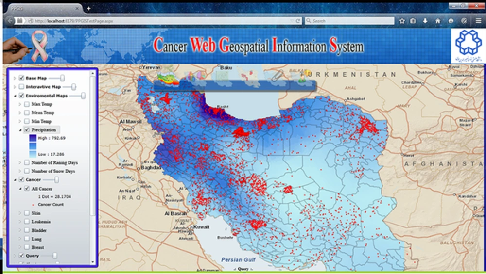
Static maps include a series of pre-prepared maps. When preparing these maps, the visualization principles have been observed to provide the user with a suitable map that can help the user to understand the status of cancer occurrence and its distribution in the country. These maps are in the framework of Choropleth and point density maps. Users could easily compare them by turning them ON/OFF and changing their transparency. These maps include reports of number of cancer patients, situation of environmental parameters such as climate in different regions Figure 8.
3.3.2.2. User-Made Maps
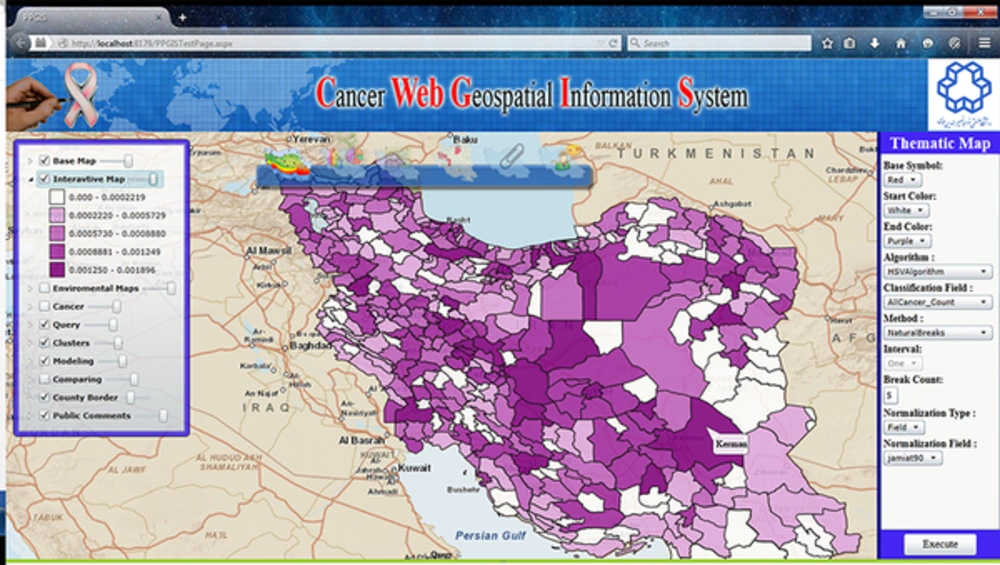
For increasing the interaction of user with system, they are considered tools by which the user will produce Choropleth map based on its favorite parameters from information present in the database. For this purpose, initially, the user selects its favorite parameter such as the number of diseases in a specific month. Then he chooses coloring, number of classes and classification method. Moreover, a map is produced based on input parameters of the user in which any class has been determined by a specific color.
In this section, we tried to consider all tools required for producing Choropleth map. After choosing the beginning and ending color, these colors are produced based on HSV, CIELab or LabLCH methods embedded in the WebGIS system and each class is displayed with a specific color. For determining the intervals of any class and their classifications, there are embedded four algorithms (i.e. equal distances, quarter, natural breaks and standard deviation, in any system). Users could also normalize the selective parameters to another parameter. Normalizing the information is very important in the issues of disease. For example, should we only consider the number of diseases reported that are higher in the populated areas? High number of disease reported for that area does not mean presence of environmental parameters influencing disease in that area and the number of diseases must be normalized by using the population rate in any region Figure 9.
3.3.2.3. Map Comparison Tools
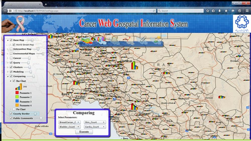
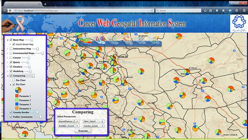
Using this tool, users can compare two or a few parameters such as the number of diseases during different years. For this purpose, according to selected input parameters, the system produces a map in which the values of parameters are indicated as a bar Figure 11 and pie Figure 10 diagrams. For example, as you can see in Figures 10 and 11, one can visually see that number of skin cancers is higher in the desert towns like Isfahan comparing to other cancers.
4. Results
Users of the developed WebGIS could easily and without any knowledge about GIS observe the situation of disease and environmental parameters in terms of static maps and user-generated maps in an interactive space.
Static maps are prepared as a series of maps by using point density and Choropleth visualization tool and users can easily compare them by ON/OFF on each layer and changing their transparency. In the user-made interactive maps, there are tools by which the user could produce Choropleth maps based on their favorite parameters. For this purpose, the user initially chooses his favorite parameter like number of cancer occurrence in a specific month, then he selects color, number of classes and classification method. Next, according to the input parameters, a map is produced in which any class has been determined by a specific color.
The results illustrate that the Choropleth maps are one of the easiest and most suitable methods for detecting the clusters by which one can visually detect the clusters and critical regions. Producing interactive maps could increase the attention and understanding of people about the cancer occurrence in their place.
5. Discussion
Media attempted hard to promote the public awareness for considering the hygiene advice and sharing data about situation of disease; however, most information provided by them is based on numerical and verbal statistics and may not provide the people with suitable understanding of situation of present disease.
In this research, a WebGIS is developed to present cancer data in form of thematic maps which users could easily and without any knowledge about GIS observe the situation of cancer occurrence and environmental parameter. Two kinds of maps are presented: static maps and user-generated interactive map. It also provided the possibility of comparing spatially various parameters in the form of bar and pie charts.
Development of this kind of WebGIS tools and increased cooperation of people in terms of inserting the spatial labels on the map to report a disease or providing their views about reasons of occurring a specific cancer in a specific region, may causes turning the process of mono-direction flow of information to users to a bi-directional flow of information. As a result, cancer specialists could use the local knowledge of people and residents of different regions of the country for analyzing the situation of various kinds of cancers.
