1. Background
Adherence to medication treatment is critical for achieving successful health outcomes. However, non-adherence is a common problem resulting from patients' lack of understanding regarding medication directions (1). Failure to comply with medication regimens can lead to negative health consequences and increased treatment costs. Evidence suggests that medication use in Iran does not follow an appropriate pattern. During the COVID-19 epidemic, it was reported that 55.5% of Iranian elderly patients engaged in arbitrary medication use, which is concerning given that only 13.3% of these patients possessed the minimum required information about the medication, including its name, category, uses, and potential side effects (2). Medication instructions may include complex medical terminology and are often presented to patients both verbally and in writing, leading to misunderstandings and forgetfulness with serious consequences (3, 4).
Pictograms are simple and clear graphic symbols used to convey concepts and instructions. They are commonly used in various industries, such as pharmacies, because they are often more effective at promoting understanding and recall than verbal or written messages alone (5). Providing unambiguous guidelines regarding the appropriate utilization of medicines has led to increased medication adherence, particularly among less educated and elderly individuals (6, 7). However, not all individuals in all cultures may correctly interpret pictograms. It is therefore rational to take into account people's culture, local customs, and lifestyles while designing pictograms (8). It is widely acknowledged that designs adhering to ergonomic principles and prioritizing human factors can enhance safety and increase comprehensibility by standardizing symbols (9, 10). Several studies have shown that redesigning pictograms while taking into account individual characteristics of the target population results in increased understandability. Adir et al. proposed that designs must adhere to the MSCA law, which includes a clear message, a well-defined structure, strong connections, and a defined aim (11). Enlarging images and incorporating text have been suggested as effective methods for enhancing understandability (12). Additionally, the use of color in images is recommended to improve attention and provide a better visual representation of elements (13). Merks et al. recommended using color in images as it can improve people's attention and provide a better representation of the elements used in the images (14). In addition, many studies have attempted to redesign signs based on demographic characteristics, taking into account individual factors like age, race, level of education, and culture. Studies conducted in South Africa, Canada, and Poland have shown that redesigning pictograms while considering the individual characteristics of the target population results in increased understandability (14-16).
United States Pharmacopeia pictograms (USPs) are widely utilized in the pharmaceutical industry. They are divided into three groups: Indicative (rectangular sign that shows the necessity of performing an action), warning (inverted triangle, which calls for caution), and deterrence (circular symbol indicating that an instruction is not followed) (17). Despite their extensive use, some USPs may not be universally understood. A recent study showed that nearly half of the USPs are not properly understood by prospective Iranian users. This finding highlights the importance of designing culturally appropriate and understandable pictograms for the target population (18).
Participatory design is one of the most widely used ergonomic methods in pharmacy (19). It is based on observing users' problems and realities in different situations as they express their desired goals and learn the appropriate ways to achieve them. However, the main challenge of participatory design is managing the conflict between what currently exists and what is possible (20). Participatory design offers advantages such as gaining insights into users' feelings and perspectives, generating creative ideas in a short time, and accurately recognizing the preferences of stakeholders (21). Accordingly, this study was designed to initiate participation through face-to-face interviews and the draw-it technique (22). This technique helped participants express their mental concepts visually, especially when verbal expression was difficult, allowing the researchers to better understand their intended meanings. A group of experts then judged the designs extracted from the participants' comments in a multi-step iterative process until the best visual language commonalities were created. This process was tested on eight selected USPs that had been identified in the previous study as having low comprehensibility.
2. Objectives
The objective of this study was to redesign medication pictograms using a user-centered approach to improve their comprehensibility and relevance. This study adopts a participatory, multi-step design approach — including the draw-it technique — to tailor pharmaceutical pictograms to the mental models of low-literate Iranian adults. This user-informed method offers a novel contribution to improving visual communication in medication labeling.
3. Methods
3.1. Study Design and Setting
This cross-sectional study was conducted over a two-month period from November to December 2022 in Tehran, Iran. The study employed a participatory approach to enhance the comprehensibility of selected pharmaceutical pictograms. To achieve this goal, several structured and systematic steps were taken, including conducting semi-structured face-to-face interviews, utilizing the draw-it technique, and organizing collaborative expert meetings. The draw-it technique, where participants sketch their interpretations of concepts, was particularly suitable as it provided researchers with insights into how individuals visually process pharmaceutical information. This method is effective in identifying misunderstandings or ambiguities in the illustrations and provides a foundation for developing pictograms that are more intuitively aligned with the target population's cognitive and cultural expectations. The first two steps helped identify the challenges associated with designing illustrations and proposed effective solutions to improve their clarity. In the final step, each design was carefully reviewed to ensure that it provided the best possible visualization based on all participants' feedback and that commonalities in the visual language of the population were established.
3.2. Participants
Participants were selected using targeted sampling. The required sample size was determined based on data saturation — when no new information emerges from additional data collection. This approach ensured that the study comprehensively captured all relevant issues and solutions related to each pictogram until thematic redundancy was reached. All participants were residents of Tehran and were recruited from a selected urban healthcare center. Eligibility criteria included being a Persian-speaking Iranian adult aged 40 years or older, with no significant health problems that could interfere with participation, normal or corrected-to-normal vision, good cognitive and physical condition, effective communication abilities, and no history of chronic conditions (such as multiple sclerosis or diabetes) that might affect drawing capacity. Individuals with prior exposure to pharmaceutical pictograms through formal education or training programs were excluded. Importantly, participants were selected based on their health literacy levels rather than formal education, as health literacy has been shown to be a more reliable predictor of pictogram comprehension (23, 24). Health literacy was assessed using the Health Literacy for Iranian Adults (HELIA) Questionnaire, adapted from the test of functional health literacy in adults (TOFHLA). This validated tool evaluates reading and comprehension skills related to health concepts and uses a 5-point scale ranging from 1 (very difficult) to 5 (very easy) (25). The overall scores ranged from 33 - 66 for weak, 67 - 132 for average, and 133 - 165 for favorable health literacy.
The study involved four experts, including one pharmacologist, two ergonomists with prior experience in cognitive design features, and a proficient graphic designer. The interviews were meticulously conducted and overseen by a specialist experienced in qualitative research and interview techniques, ensuring the integrity and depth of the data collected.
3.3. Pictograms Selection
Eight pictograms were selected from USPs previously reported to have the lowest comprehensibility for Iranian prospective users (18). To determine which pictograms to focus on, nine experienced pharmacists, each with a minimum of five years in pharmacy sales, marketing, or medication delivery, participated in the selection process. Importantly, none of them were experimental pharmacists. The pharmacists were then asked to rank the 24 poorly understood images from most to least usable. Eight pictograms with the highest potential for use in national medication labeling were finally selected (Figure 1). Each pictogram was printed in black and white on a separate A4 sheet, sized 4 × 4 cm, without any additional meaning or interpretation.
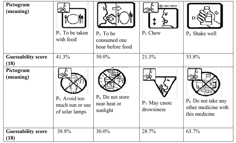
Figure 1.
Selected pictograms studied (18)
3.4. Procedure
Ethical approval for this study was obtained prior to its commencement (IR.SBMU.PHNS.REC.1400.107). All participants provided written and verbal informed consent before participation. The researcher explained the purpose and process of the study to each participant, obtained their consent, and conducted the interviews in a private room. The interviews lasted between 6 and 32 minutes, with an average duration of 14 minutes. Before conducting the main interviews, two pilot interviews were conducted to refine the approach and ensure clarity in the research process.
Each interview consisted of two phases: (1) Explaining design problems and solutions to improve understanding of selected drug images from stakeholders' perspectives, and (2) drawing proposed images using participatory design and the draw-it technique. The interviews were recorded and transcribed verbatim. The participant was first asked to guess and verbally explain the meaning of each pictogram. The order of pictogram presentation was randomized. If the interpretation was incorrect, the interviewer explained the correct meaning to the participant and asked for suggestions to improve clarity.
Once all the participant’s opinions were disclosed, they were given a pen and paper and requested to draw a picture for each intended message in a way that they thought would help better understand the medication instructions. This drawing exercise enriched and clarified the earlier interview data. All visual elements in the drawings provided by participants were carefully taken into account. Accordingly, key considerations for enhancing illustrations were determined. Additionally, drawings created using the draw-it technique were analyzed to identify common patterns among them. Subsequently, a preliminary design was prepared for each of the studied pharmaceutical pictograms based on the findings of the two aforementioned steps.
These preliminary graphic designs were presented to experts for review to ensure their compatibility with the participants’ visual languages. After each meeting session, the graphic designer refined the designs based on the feedback provided by the experts and created updated graphics for the next meeting. Expert meetings continued until the goal was achieved, with each meeting lasting approximately an hour.
4. Results
Upon reaching data saturation, a total of 22 participants, comprising 5 women and 17 men aged between 40 and 80 years, took part in this study. Their health literacy scores ranged from 67 to 132. In total, 34 images were generated using the draw-it technique, with pictograms 1 and 6 being the most frequently drawn due to their simplicity. No images were drawn for pictogram 3, as most participants found it challenging to represent the concept of "chewing". The analysis revealed that participants tended to draw larger images with higher magnification, adding meaningful details such as beds, water glasses, and food, while generally avoiding abstract elements. Some examples of participants’ drawings are shown in Figure 2.
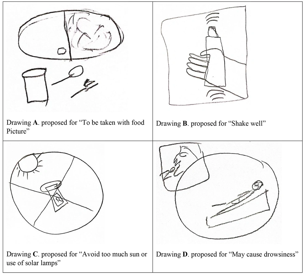
Figure 2.
Examples of the draw-it technique
More specifically, participants aimed to enhance clarity by simplifying the images and removing unnecessary details found in some of the original pictograms. Key problems and proposed solutions for each pictogram are outlined in Figure 3.
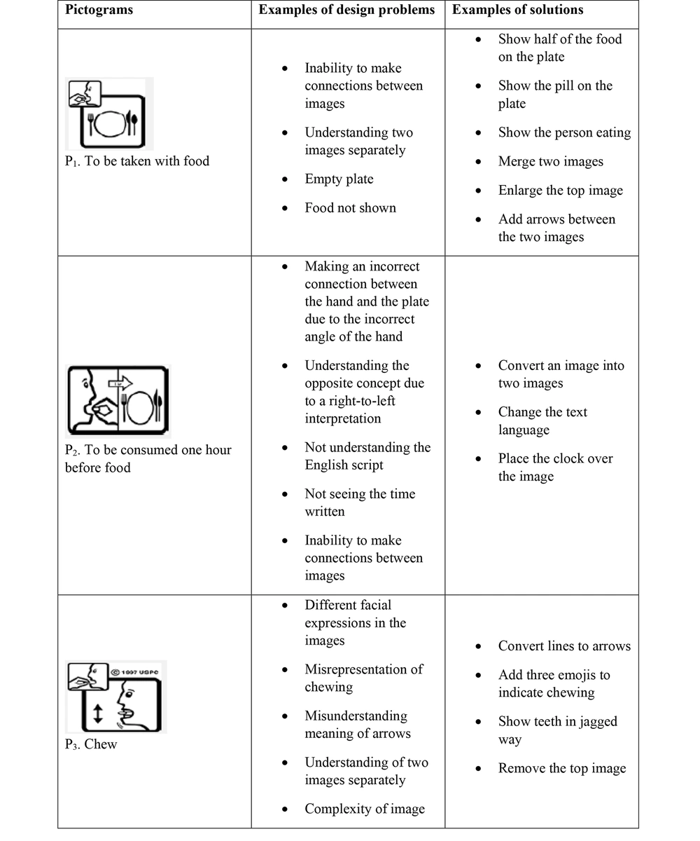
Figure 3.
Examples of design problems and solutions for each pictogram studied
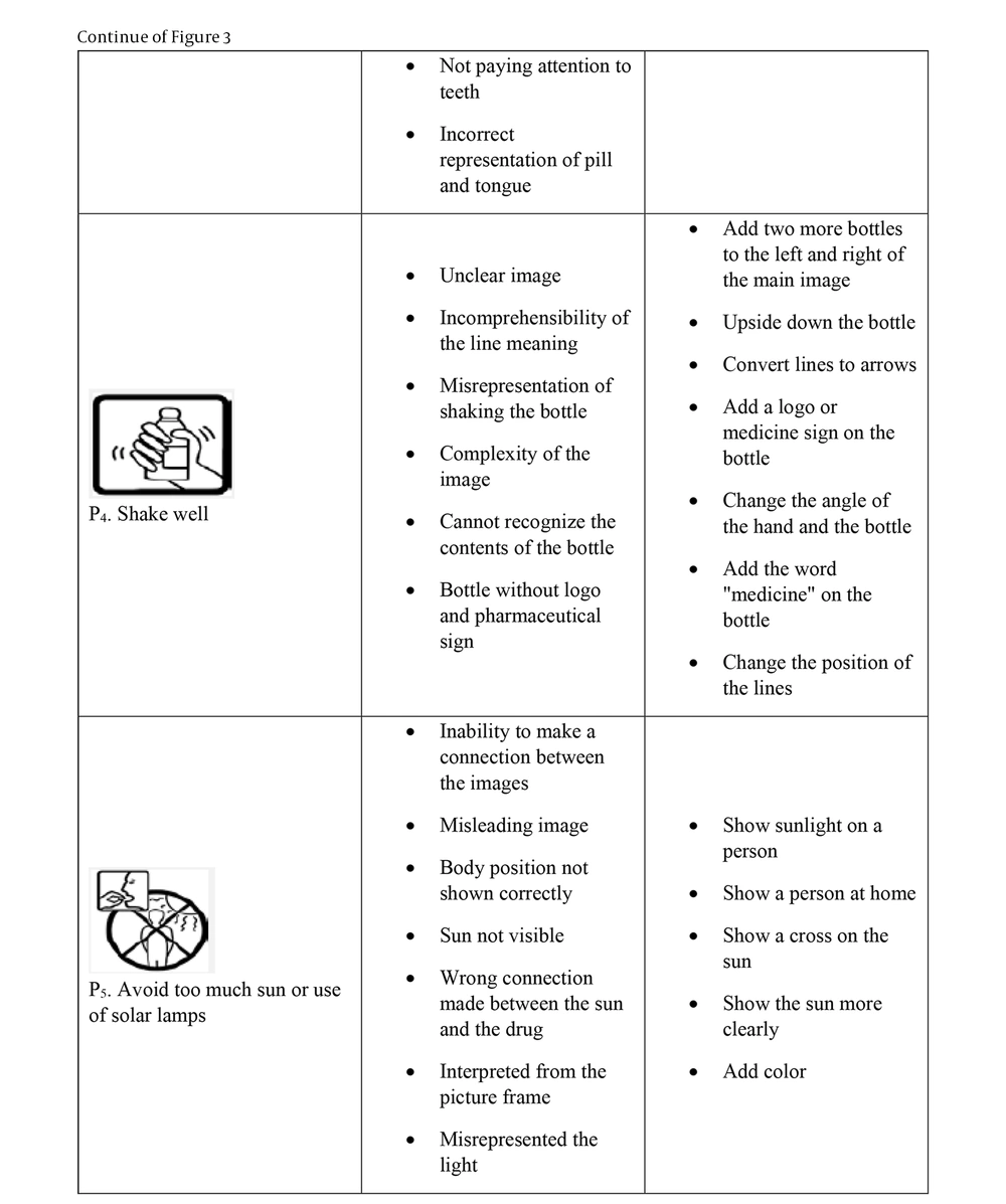
Figure 3.
Examples of design problems and solutions for each pictogram studied
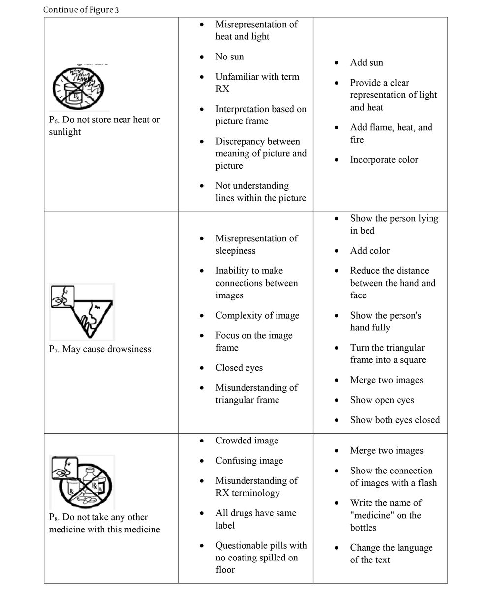
Figure 3.
Examples of design problems and solutions for each pictogram studied
4.1. Expert Meeting Findings
Based on the previously described participatory design process, a preliminary plan was proposed for each pictogram. Experts were consulted in a series of meetings until consensus was reached on each redesigned pictogram, ensuring they aligned as closely as possible with the participants’ mental schemas. The first observation made by the experts after reviewing the preliminary set of redesigned images was that each image depicted medication and individuals in different formats. Experts recommended adopting a consistent format for all images, ensuring that the representation of a person showed similar facial features and hairstyle. They also suggested removing pills from outside of the medicine packaging to minimize distractions and drawing medications in full view with solid lines. Furthermore, it was recommended that each image should be enclosed within a separate frame.
The main suggestions from the first expert meeting were as follows.
4.1.1. Pictogram 1: Taken with Food
As the plate was drawn empty, it failed to convey the meaning of food. Therefore, it was proposed to depict a chicken thigh on the plate to better illustrate taking medication with food.
4.1.2. Pictogram 2: Consumed One Hour Before Food
The specified arrow was proposed to be placed at the end of the next line, with “1h” written in Farsi. For better cultural adaptation, a spoon and fork should replace the existing knife and fork, positioning the spoon on the right and the fork on the left of the plate to indicate that eating has not yet commenced.
4.1.3. Pictogram 3: Chewing
The image required redesigning to better represent the concept of chewing. The person's eyes should be open, and adding a frame that magnifies the person’s mouth and teeth was suggested to enhance the visualization of the act of chewing.
4.1.4. Pictogram 4: Well Shaken
No comments were provided for this pictogram, and therefore, no changes were recommended; it was considered the final design.
4.1.5. Pictogram 5: Avoidance of Excessive Sun or Solar Lamp Exposure
The person’s body should be fully represented with drops of sweat on the face, and the sun should be enlarged to more clearly reflect heat. Additionally, unnecessary extra lines and dashes should be removed to avoid confusion.
4.1.6. Pictogram 6: Away from Heat and Sunlight
Again, unnecessary extra lines and dashes should be eliminated to prevent misinterpretation of the cloudy parts in the sky. The sun’s size should be enlarged, and displaying a thermometer would better convey the concept of heat.
4.1.7. Pictogram 7: Possible Drowsiness
The image should be placed within an inverted triangle without a danger sign. Moreover, since drowsiness is a potential side effect of medication use, a person taking the medication should be depicted instead of just the medication itself.
4.1.8. Pictogram 8: No Concurrent Use with Other Medicines
A sheet of pills should be illustrated next to the person in the main pictorial frame, accompanied by a prohibition frame containing various images of packages of pills, syrups, vials, and ointments. The graphic designer modified the preliminary sketches based on the feedback from the first expert meeting. In the second expert meeting, this revised set of pictograms was evaluated. The experts emphasized that further adjustments were still needed to enhance clarity and consistency across the images. These included eliminating unnecessary empty spaces within the picture frames, standardizing the frame sizes to maintain visual coherence, and adjusting the position of the tablet closer to the mouth to better convey the concept of medication consumption.
More precisely, the following additional suggestions were presented from the second expert meeting: For pictogram 1, it was suggested to depict only one chicken thigh inside the plate and to draw the spoon and fork in white instead of black; for pictogram 2, "one hour" should be written in the designated area on the clock, and the display of the medications in this image should be magnified; pictogram 3 required further redesign, featuring jagged teeth, the person's face in profile, half of the pill placed in the mouth, and a circular arrow on the cheek to indicate chewing; for pictogram 5, the sun should be enlarged, and all unnecessary lines should be removed; pictogram 6 needed adjustments to modify the size of the sun; pictogram 7 required alteration to show the subject in profile with half-closed eyes and a hand in front of the mouth; Finally, for pictogram 8, various packages of pills, syrups, vials, and ointments should be illustrated within a circular frame.
In the third expert meeting, all revised images were approved and finalized as the selected versions (Figure 4).
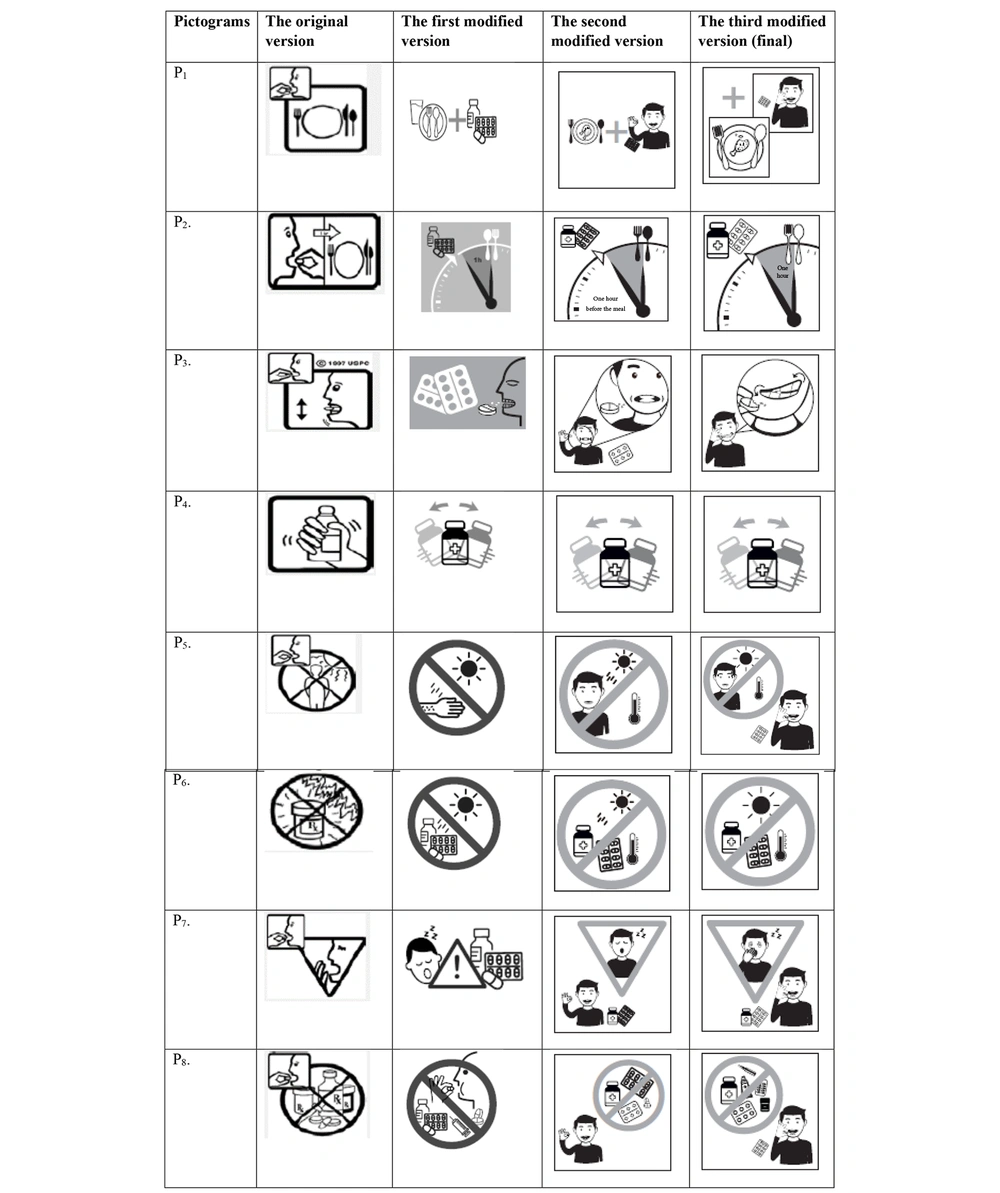
Figure 4.
Comparison of the original version and modified versions of the pictograms
5. Discussion
The application of human factors and ergonomics (HFE) methods holds significant promise in the pharmaceutical field, particularly in addressing specific challenges related to medication safety and comprehension. This study aimed to accurately depict the mental schema of prospective Iranian users to enhance the design quality of selected USP pictograms and create more comprehensible pictorials for medicine instructions. By focusing on the HFE approach, the study highlights how intuitive design can address common misunderstandings in medical instructions, thereby enhancing usability and reducing potential risks associated with misinterpretation.
The participatory design method actively involves all stakeholders, including end users, developers, and researchers, while a multi-step approach ensures that the final product aligns with user needs, usability, and safety. This approach could also serve as a model adaptable to other cultural settings, making it valuable for global applications in healthcare communication. This multi-step, iterative process, including repeated expert consultations and user feedback, demonstrated a structured path to achieving the core objectives of the study: Improving comprehension of medical instructions.
It is evident that key factors in the creation of pictographs extend beyond mere design elements; the characteristics of prospective users play a pivotal role in ensuring the comprehensibility of pharmaceutical pictograms. Influential factors include users’ native language, culture, pharmaceutical knowledge, and lifestyle (26). In selecting a participatory design methodology, the study embraced a culturally adaptable approach, which better accommodated the unique preferences of Iranian users and enhanced the relevance of the pictograms. This culturally tailored design process, particularly focusing on the unique needs of Iranian users, represents a novel contribution to the field, demonstrating how participatory and culturally responsive design can elevate the accessibility and effectiveness of healthcare materials.
Previous researchers have employed participatory approaches to create pictographs for healthcare purposes (8, 19, 27-29). Some of them proposed techniques such as “draw-it” or “flashdraw” to assist participants in visualizing their mental images more effectively. However, while these methods have shown efficacy across various contexts, the current study extends previous work by emphasizing culturally specific elements and testing them directly with target users in a real-world context. For instance, Vaillancourt et al. utilized a mixed-method approach, combining an iterative design process with the "draw-it" technique, to develop pictograms aimed at improving medication safety practices among healthcare staff (30). It is demonstrated that the application of the flashdraw methodology within a participatory framework is not only effective but also time-efficient (22).
Based on patient feedback, Perri et al. created pictorial cardiovascular guidelines, highlighting that pictorial features such as direct representation and familiarity, along with demographic factors such as race, gender, native English language, and education level, significantly influence the comprehensibility of pictographs (28). The current study builds upon these insights by emphasizing the significance of adapting visuals to the lifestyle and cultural norms of Iranian users, as evidenced by the preference for familiar items such as a spoon and fork over a knife and fork. These findings underscore the importance of user characteristics in the understanding or misunderstanding of pictograms. For example, participants struggled to interpret the meaning of “1h” simply because they lacked English proficiency. Similarly, they were unfamiliar with the abbreviation “RX”. Other non-native English speakers, such as South African subjects, also encountered difficulties in comprehending this abbreviation (31). Therefore, it is advisable to represent symbols according to the lifestyle and culture of prospective users to enhance understanding (14-16). This was evident in the participants’ preference for seeing a spoon and fork alongside the plate, rather than a knife and fork, as the former representation was more culturally relevant and familiar to them.
As a rule of thumb, the interpretation of graphic images begins with the identification of symbols they contain; thus, an appropriate level of complexity is essential for understanding images (32). McDougall et al. emphasized that simplicity is the best strategy for icon design, particularly when response time is critical (33). To adhere to the principle of simplicity, redundant components should be eliminated (13). For instance, in pictorial P8, the depiction of pills outside the medication packaging was deemed overcrowded, adding unnecessary details that obscured the intended message. While simplicity is crucial, preserving key details that aid understanding is equally important. For example, this study showed that a fully depicted plate with recognizable food items significantly improved comprehension, a finding supported by previous research indicating that an empty plate might confuse viewers, while a filled plate clearly conveys the intended meaning (31).
Striking a balance between avoiding complexity and retaining critical details often leads designers to employ the "pair image" approach. Previous studies have shown that interpreting paired images can pose challenges for users (34). In the current study, a “plus sign” was utilized to indicate the relationship or sequence of actions (P1). Likewise, abstract symbols can be difficult to comprehend due to their lack of transparency (35, 36). Therefore, using concrete items is preferable to employing abstract items when creating images (33, 37). The participants’ suggestions regarding some abstract elements in P4 and P5 support this recommendation. Ultimately, prioritizing culturally aligned, familiar symbols and maintaining simplicity while retaining essential details can significantly enhance the comprehensibility of medical instructions. This approach holds promise for improving patient safety and medication adherence not only in Iran but also in other cultural contexts.
5.1. Conclusions
This study highlights the importance of incorporating HFE principles in the design of medical representations to enhance their clarity and usability. It presents several strategies for improving the effectiveness of these materials. Specifically, the study developed culturally relevant pharmaceutical pictograms for eight essential medication instructions tailored to Iranian users. By employing an iterative and participatory approach focused on user needs, the final designs are anticipated to be easily understood by the target population, thereby contributing to improved patient safety and better treatment outcomes. Ultimately, these findings suggest that culturally sensitive design processes can play a crucial role in creating user-friendly medication instructions that support better patient comprehension and adherence. However, further studies are required to assess the comprehensibility of the developed pharmaceutical pictograms in real-world healthcare settings.
5.2. Strengths
The strengths of this study include its use of a participatory design approach, allowing end-users to actively engage in the design process, which improves the alignment of pictograms with user needs and understanding. Additionally, the study’s focus on cultural adaptation enhances the relevance and comprehensibility of pictograms for Iranian users, while the multi-step, iterative process ensured optimal refinement through repeated feedback. Emphasizing HFE also contributes significantly to creating user-friendly, error-minimizing designs.
5.3. Limitations
Despite these strengths, the study also has limitations. The relatively small sample size, although sufficient for qualitative saturation, limits the generalizability of the findings. Additionally, the focus on a specific adult population in Tehran may reduce applicability to other age groups or cultural settings. While the study prioritized health literacy over formal education — a strength in terms of real-world applicability — it may still not capture the full diversity of user experiences across different regions. Another limitation is that the redesigned pictograms were not tested in real clinical environments, and therefore their actual impact on patient behavior or adherence remains unknown. The relatively short interview durations may have constrained the depth of participant feedback. Finally, while the pictograms were designed to be language-independent, prior findings and user feedback revealed that English terms or abbreviations (e.g., “Rx”) decreased understanding. This underscores the importance of avoiding non-native terminology and continuing to adapt pictograms to users’ visual and cultural expectations in future iterations.
5.4. Future Research
Future research should evaluate the redesigned pictograms in real-world clinical settings, test their effectiveness across diverse populations, and assess their impact on medication adherence and patient safety.